(This article was first emailed on August 9th, 2021 to fans who had registered an interest in finding out more about our Tricorder.)
Note: The response to the email newsletter of this blog post was amazing. As soon as the email was sent out, a number of fans kindly wrote to us giving us new information and further detail about The Star Dispatch front page. Please note that some of the text and images in the blog below have been revised from the newsletter to reflect the new information. In summary:
- The image of the newspaper reporting the ‘Ms. Keeler Lives’ timeline has been updated with a revised masthead, and the subhead and article body copy has been corrected with the new text.
- The ‘Ms. Keeler Lives’ timeline newspaper was a prop made by the prop-making company Earl Hays Press, who have been making prop newspapers and other fictional prop documents for film and TV shows since 1915.
- A full-sized scan of the whole front page of the ‘Ms. Keeler Lives’ newspaper, complete with fully legible type, is held on record in the Academy of Motion Picture Arts and Sciences (AMPAS) archive, here.
- The typeface used for the headline font is McCullagh, designed by G.F. Schroeder in 1898.
- The main reality newspaper filler article, Americans Warned Out, which is clearly visible above the main headline as the camera zooms in, mentions Thailand, even though, in 1930, Thailand was still called Siam. In fact, it wasn’t until 1939 that Siam’s name changed to Thailand, three years after the ‘Ms. Keeler Lives’ alternative timeline newspaper was published.
A massive thank you to everyone who wrote to us with this wonderful extra information and helped us refine this important piece of tricorder content.

The Star Dispatch redrawn masthead, with all those hard-to-see details revealed, thanks to everyone that emailed us with more information about this special piece of tricorder content.
Since the 1930s it’s been a staple sci-fi trope: bumped back in time, a protagonist inadvertently creates a paradox, when their action or inaction in the past alters the future (their present), erasing their existence and thus paradoxically also erasing their future-altering action.
In perhaps the most highly rated Original Series episode, City on the Edge of Forever, Kirk and Spock play out this storyline as they chase McCoy through a time portal back to 1930s New York with the plan of preventing an action that has drastically unhinged their present. (Spoilers… although glossed over in the show, it is actually their interaction with the past that caused their current present in the first place.) In the process, courtesy of the portal’s keeper, the Guardian of Forever, Spock is lucky enough to ‘download’ a precursor of the internet onto the tricorder (for later research, we assume) and, as a result, we are treated to the most visually arresting use of the tricorder’s screen that The Original Series ever offered.
As with many decisions we made about our tricorder’s function wish-list, early in the design process, it was clear to us that our replica needed to be able to play out this pivotal tricorder moment as accurately as possible.
Key to the story, and the tricorder’s only on-screen use as an image viewer, are the newspaper images featuring the two Edith Keeler timelines displayed on the tricorder’s screen. Although images on our tricorder’s 320 x 240 pixel screen are going to be small, it is important to have clean, crisp originals which we can use to create the most authentically pristine, real-tech experience. The readily available blurred, grainy, low-contrast screen captures, with their misshapen cutouts, were never going to be good enough and, as the originals have been lost in a time vortex of their own somewhere in the last 55 years, it was also obvious that some blend of internet research and extreme retouching was going to be needed to recreate the original images at an appropriate quality level.
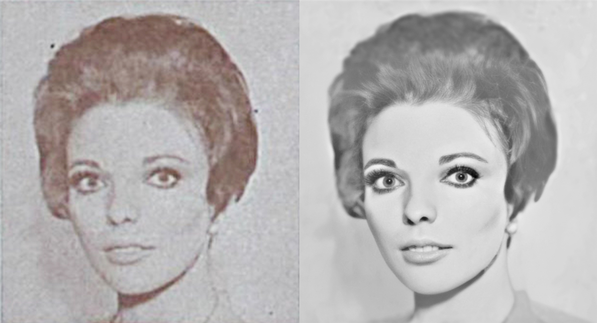
On the left the original screencap image. On the right, a bit of tidying up with Photoshop to remove the worst of the unwanted artifacts allows an AI-driven deep learning app the best chance of recreating the lost detail in this image of Edith Keeler, aka a young Joan Collins.
Long before I studied to be a biomedical materials engineer, I toiled as a London-based graphic designer so, spinning forward to the present, while the rest of the team does all the hard stuff solving some of the finer mechanical engineering and firmware interaction conundrums, I get to have some fun flexing my design and illustration skills with Adobe’s two flagship apps, Illustrator and Photoshop, building on a bit of forensic homework.
There are some powerful apps that combine artificial intelligence and deep learning to recover detail in blurred photographs. I found the easiest to use (for faces) is the photo restoration service built into the superb MyHeritage ancestral research website app, intended for rejuvenating old family photos. It’s a simple process to upload images and apply the app’s incredible Enhance feature. The science of what is going on behind the scenes is mind-bendingly mathematical and complex, but the results are simply breathtaking. To be fair, even the best screencap images of Edith Keeler are on the very edge of what can be rescued. So to give MyHeritage the best chance of working, before using Enhance, I treated each photo to a manual Photoshop tidy-up to remove some of the more obvious facial deformities and increase the contrast between the subject and the background.
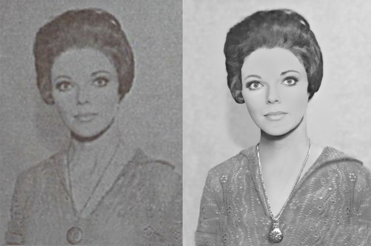
The MyHeritage image Enhance app tackles faces but doesn’t help with clothing and backgrounds. Contemporaneous publicity shots provided reference material for the necklace and her crocheted top.
MyHeritage can only help restore the face… the background and clothes require other tricks. A search for promotional shots of a young Joan Collins as Edith Keeler unearthed a great picture of her that looked as though it had been taken on the same day as the picture that was used for the alternative timeline newspaper image – the crocheted top draped over her shoulder in an almost identical way. It was a pity that the image wasn’t taken at quite the same angle and there was not quite enough material, but once again, Photoshop came to the rescue. Photoshop’s prodigious capacity for distorting images and cloning areas to extend them enabled me to put something together that looked mostly like a sharper version of the loose-fitting jersey seen in the original newspaper image.
With these two key iconic pictures restored, I turned my attention to rebuilding the newspaper pages themselves. A moderately deep (but, as it turns out, not deep enough) internet search didn’t initially turn up anything properly helpful in reviving the text of the two featured The Star Dispatch newspaper editions, and I set about deciphering the subheadings and incidental column text so I could build a couple of new pages to take the images. It was fun working out what was in those articles – feeling my way through, word by word, almost sensing each one by the barely recognisable blob that it had come to be based on just shape and context in order to build up plausible sentences. However, weeks later, during a further search for suitable pictorial reference of the masthead I stumbled upon the excellent and thorough work of Jörg Hillebrand and Bernd Schneider who had also already decoded most of the text on both newspapers’ front pages. Thankfully, my text mostly concurred with their deciphering but, where it didn’t, I updated mine with their more accurate interpretation, at the same time gaining a new understanding of where the text originally came from*.
*As noted above the text of the Edith Lives timeline newspaper has been further updated with the correct text taken directly from a high-resolution version of the original prop held in the AMPAS archive, following helpful fan comments.
For much of the copy that was going to be too small to read at the finished size, I used lorem ipsum filler text, although I took care to make sure the paragraph breaks visually matched the originals as closely as possible.
The Star Dispatch masthead as seen in the Edith Keeler alternative reality newspaper is mostly obscured and not really clear enough to use as origination or to trace over, even for our small display. Although no matching typeface could be found [initially], the hunt for a clearer reference of it turned up a number of different versions of The Star Dispatch newspaper [created by the Earl Hays Press], which did the rounds as a movie prop (complete with various different headlines and relevant articles) for 20 or 30 years through to the 1960s. Although this image was still rather indistinct, a screencap from Second Sight, a 1966 episode of The Fugitive, provided a Star Dispatch masthead image with enough clarity for me to have a go at tracing the type along with the winged eagle-badge emblem. Despite a long search, I was unable to find an image of enough quality to elucidate all of the text in the banner that underscores the masthead clearly enough for me to be sure exactly what it all said. Most of it can be worked out, but the second block of text in the left-hand flag I found impossible to decipher. After much deliberation, I winged it with words of about the right length that made sense when taken in context with the ones that I could actually decode. As it stands, The Star Dispatch motto, (until someone advises me otherwise), is therefore now, ‘The Leading Daily Newspaper in the State’. **
** With access to an image of the AMPAS archive version, it is clear that The Star Dispatch moto is, in fact, ‘The Fastest Growing Newspaper in the State’.

The newspaper that Kirk and Spock view is none other than The Star Dispatch – a newspaper that pops up in many different shows through the years. Shown here, left to right, a small sample of some of the many other movies and shows it appears in: a 1945 movie prop (provenance unknown), Caught (1949) and The Fugitive, Second Sight (1966).
With all the elements restored, reassembling the newspaper page was relatively simple. It’s a standard six-column measure and, in keeping with the 1930 typography style, the typefaces used are similar enough to Century in various weights, widths, and a couple of styles with a rather flexible approach to kerning and leading. Some of the subheads are set in what looks very much like either Gill Sans or Futura, and the font Clearface is a near-enough match for the name under each of the photos. In the episode a pan and zoom effect was used for each newspaper. Importing the screencaps into Adobe Illustrator, and then sizing them so that they lined up, provided the necessary background required to build the required area of each page.
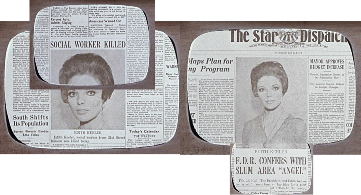
Lining up the images shows the dramatic use of zoom as a device to visually emphasise different parts of the two news articles.
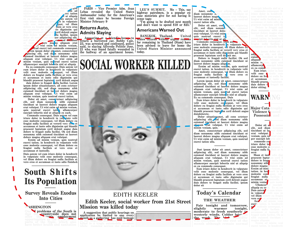
The “main reality” newspaper pans and zooms in for a close up of the all-important headline reporting Edith Keeler’s death.
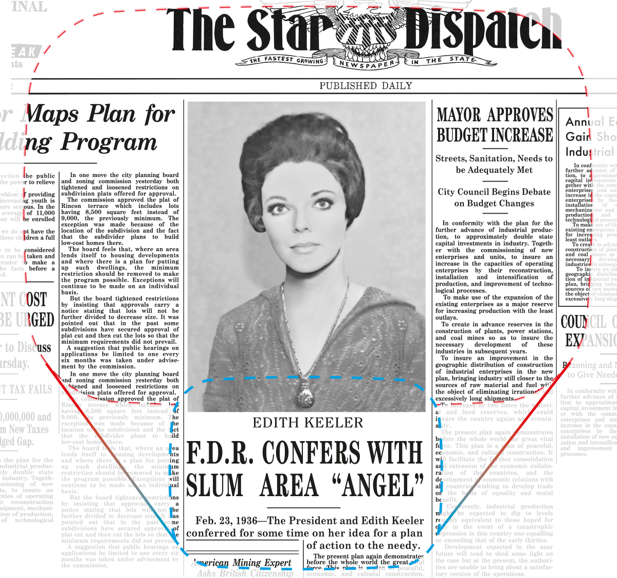
The alternative reality newspaper… Ms. Keeler lives, Germany wins WW2, and the timeline that gave the world the Enterprise does not exist. (In a strange twist, this could have been the un-doctored reality if Kirk, Spock, and McCoy had not caused Edith Keeler to walk across the road, a reverse grandfather paradox.). In this case the page zooms out as it pans up to reveal a very healthy looking Edith Keeler, six years past her sell-by date. Now revised to show more accurate masthead and revised subhead and body copy text.
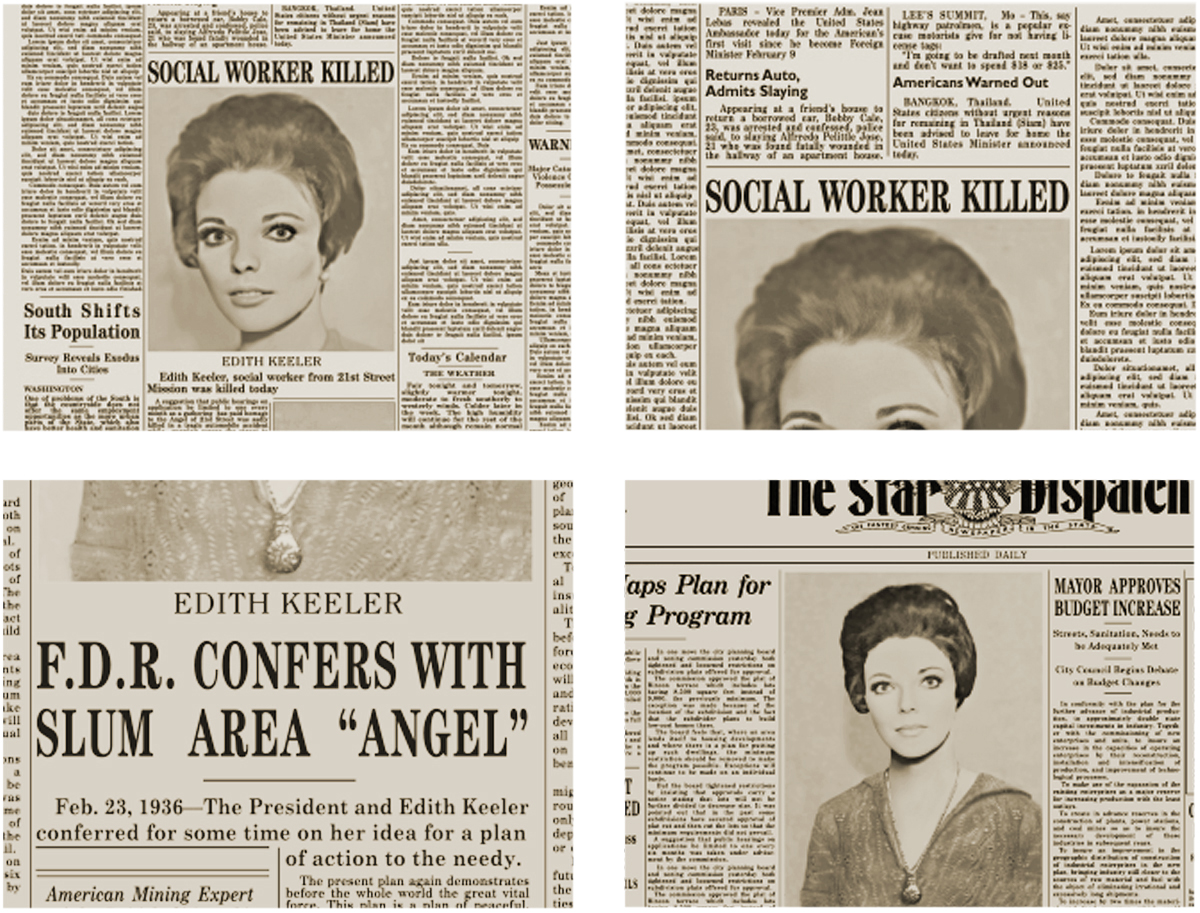
The four main Edith Keeler newspaper images shown at their final resolution. These images have each been saved at a resolution of 320 x 240 px; the actual size you are viewing them at will depend on the screen resolution of the device you are using to read this blog.
In the end, even at the tricorder’s display resolution of 320 x 240 px, where much of the detail is lost, the benefit of the restoration work on the photographs and type is evident. We are now free to crop the images to suit our display resolution and the tricorder’s new screen geometry, and the photographic images will look as good as they can on the tricorder’s screen.
As time travel stories go, the City on the Edge of Forever presents a surprisingly consistent timeline. At the end of the show, the portal’s guardian tells the away party that, “Time has resumed its shape…” but you could argue that, in fact, given the events we have just witnessed, time never actually deviated from its shape. Because, despite how it looks, Kirk et al don’t jump through the portal to fix a potential deviation from the accepted timeline caused by McCoy, they jump through to fulfill their destiny to cause Edith Keeler’s death as part of the only known timeline. It could never have been any other way.
In modern times, the idea of time travel first appeared in literature early in the 18th century. However, it’s amazing that it wasn’t until 1930, (just when Kirk was swooning over Edith Keeler), that writers hit upon the idea of the grandfather paradox and its potential to add highly thought-provoking consequences to the time-traveling genre that already offered an infinite universe of storytelling possibilities.
With every step of the tricorder development more information about its provenance and the richness of the details that support it make the journey so interesting and rewarding, adding subtle layers of intrigue and depth to an already seminal piece. Perhaps we were always destined to develop the tricorder replica and then perhaps you were always destined to own one… only time will tell.
LLAP
Chris

Coming next time
The Wand Company tricorder crew
Fans who register with us will be the first to read our news and the progress of this exciting Tricorder development and, later, where and when to purchase it. You can catch up with the story so far here on this blog, but if you haven’t already done so, why not register your interest in the Tricorder – you’ll then receive a personalised registration certificate and early access to these updates (before we publish them on our website).


This is excellent work but considering how much you are striving for extreme accuracy, I do have two detail questions about the second photograph of Joan Collins.
1. Why have you deleted her sternocleidomastoids?
2. Why is the locket now centered on the “V” of her blouse instead of laying off to her right as in the original photograph?
Otherwise, color me VERY impressed!
In answer to both your questions, the clothing part of the image rebuild came from a much sharper image that was at a very different angle, and various levels of distort were used to make the crocheted top fit the newspaper image. The top came with a locket that looked similar, although actually not completely the same as the newspaper one, and was in a slightly different position. I tried cutting it out and repositioning it, but the effect was even less convincing. There is a link to the promotional image that was used to repair the newspaper image, you can see from that there is not quite enough material to use.
Thank you for the prompt reply sir! If this product is as well done as the phaser and communicator, which we have every indication it will be, it’s going to be a home run. If anything, this one seems to have even more functionality than the other two. I’m very excited to add this to my collection and thank you folks for doing such a stellar job!
Hello TWC
Incredible work cleaning up the images and deciphering the text. Is it possible that the image of Edith Keeler is “TOO” clear for a 1930 newspaper clipping? It seems like a bit of pixeling would be accurate. Unless this kind of detail won’t be noticed on the small Tricorder screen.
Thanks
jim
At the tricorder screen size, the dot screen of the halftone used in the actual newspaper article would cause an unwanted moiré effect as the halftone dot screen clashed with the pixels of the small screen. At different sizes the effect would be noticeable at different intensities, causing potentially unpleasant moving effects over the image. In this image, the effect can be seen with the original halftone newspaper image reduced in size even when screen-grabbed on my high-resolution computer monitor. The tricorder screen is 320 x 240 pixels, which would greatly enhance the effect.
Makes perfect sense Chris. Thanks for the explanation!
jim
Concerning the tricorder archive. Will I be able to upload (data transfer) my own archive data which I would want to have access to, or is this archive locked (read only).
The archive is read only at the moment.
“…you could argue that, in fact, given the events we have just witnessed, time never actually deviated from its shape.”
Except there is that side loop, where time was temporarily altered, which lives on in the memories of the away team, and which in some way must therefore continue to exist. Indeed, the vicinity of the Guardian must be a special Time Lord-like zone where multiple timelines can coexist like that, or else the away team would have disappeared as soon as McCoy ran back in time.
That given, I think it’s interesting that the thing that minimizes the paradox is that Kirk and Spock didn’t have any clear knowledge of precisely how she died, so they couldn’t do or say the wrong thing and rewrite history – any way she wound up getting hit by the truck would work, and as you point out, that’s the way it always had happened.
One of the few paradox-free stories I know is the Doctor Who episode The Fires of Pompeii, where at the end they rescue a Pompeiian family. The Doctor resists because it’s rewriting time, but then it could simply be that that had always happened, and there’s no paradox because we have no records to be magically changed, and – key – no one in the TARDIS is rewriting their own history. (Unlike in The Waters of Mars where headlines disappear before one’s eyes, as in City – total grandfather paradox when you’re rewriting your own history.)
Anyway, really impressive work on the newspaper – it’s the sort of thing I would take a geeky perfectionism in – matching typefaces, etc. – so I’m very impressed!
In the words of a Doctor, Richard and I once met… tricky this timey wimey stuff!
Chris,
Not to sound like a broken Tricorder, but this is simply amazing work. Looking forward to the team article. I’m sure the people behind the amazing work are just as amazing themselves (if not more so).
v/r Mike
so looking forward to this!
It would have been NICE if you would have incorporated the Video recording/playback feature as was supposed to be the main function in the tricorder in the show….with ALL you crammed into this, it would have been easy
Easy is a relative term. Actually, it would not have been easy for us so we decided not to do it. Further, there is no obvious place for a camera as shown onscreen or in the prop, and the video recording, compression-on-the-fly, and decompression on playback are all hardware and software-intensive operations that due to costs and time constraints we could not include this time. The tricorder will be able, however, to record and playback audio and data captured by the onboard sensors, which we hope most fans will feel fulfills the recording element of the tricorder’s triad suite of functions.
Mike, don’t worry, the answer is yes. It seems that some email client accounts have a habit of bouncing emails that they think are spam. We resend the newsletter and most soft-bounce recipients seem to receive this resend. We will open preorders after announcing it in a special newsletter (hopefully later this year) but will keep the preorder window open long enough for all fans to place their preorders. However, to be sure to get the newsletters when they are sent out, please consider registering for a Gmail account. They are free and you can arrange it so the incoming mails arrive in your normal inbox. Gmail users have no problem receiving our newsletters when they are sent out. If you continue to worry about this, please contact us via support@thewandcompany.com as that is the best place for us to be able to advise you directly.
I am very impressed with what has been done to date. I expected great features and accuracy judging from what was done with the phaser (I own two) but the level of physical detail and electrical functionality is amazing. I will definitely be ordering a Tricorder.
I missed pickup up a communicator when those were available. I hope that there will be another run of those in the future. It would be nice to complete my landing party set 🙂
Thanks for all the hard work and giving everyone a glimpse into product development and DFM.
Chris,
On the Arm cortex-m7 processor package you selected, did you consider the possibility of incorporating integrated bluetooth? Similar System-on-Chip packaging based on an Arm Cortex-M4F core with integrated BLUETOOTH® 5.2 Low Energy (LE) exist for the m7 and would add a customizable dimension that could extend this beyond being a highly functional prop. With Pi, bluetooth, and some thought, we could start with a handheld scanner units actually providing input.
I am so excited about this project. Finally, a tricorder we all have been waiting for. I’m elated. thank you Wand company. Please make a blue tooth TOS ear receiver next. thank you for all you’re doing for the Star Trek prop lovers.
I’m guessing she would have gone to that Clark Gable movie alone and gotten hit by the truck while daydreaming about meeting a nice Shatneresque young man, but the description of time disruption given in this episode is particular to the phenomena created by the Guardian, so we don’t need to worry too much about it. I’m grateful for the thought you’re putting into this, and eager to see more.
My dearest friend Mike Cope passed away; he turned me on to this amazing work; I want to purchase one when it is ready. Again, THANK YOU all for the dedication to detail.
As far as I can determine, Joan Collins’s “locket” in the publicity shot IS identically the same as in the newspaper pic.
However, it should be noted that it does not appear to be a locket as such, but rather a pocket watch, suspended from the bow.
In the original picture, the pendant (the stem that connects the bow and crown to the case) all but disappears in the resolution, whereas in the reconstituted image, it seems to have been made much too thick.
Just to clarify, here’s a link to an item that very closely matches what I think I see when I’m looking at the “locket”, in terms of how it’s suspended from the chain:
https://www.bidsquare.com/online-auctions/whitleys-auctioneers/vintage-sheffield-mechanical-pendant-watch-4400537
Obviously, the actual pattern of the relief on the watch’s back (facing front on Collins, just as it would have been worn at the time) and the exact type of chain are significantly different. But the proportions and general geometries seem pretty much identical.
Hello i was just wondering when the actual release date will be for tricorder please. looks like it will be worth the wait .thank you Joseph
Concerning a prospective medical scanner for the bottom tricorder compartment. Would your company consider the possibility of building this as it would make the tricorder a more complete build. Nothing fancy, just a simple thermal camera which remote control drones employ now. The heat signature image can be Bluetooth shared to the tricorder viewscreen as a real-time image or would “photograph” a thermal image then can Bluetooth data transfer the image file to the tricorder memory archive where a user could pull up that image to the tricorder viewscreen. The medical scanner (could) be corded to the tricorder compartment or cordless (and thus itself rechargeable). If corded, then the bottom tricorder compartment would need to already have a plugin jack for the future medical scanner (add-on).
Nothing fancy! Err the things you mention sound fancy to me and a lot of work and bluetooth is a lot more complicated than people think. I am sorry but the tricorder will not be having this functionality… sounds fun though.